- The WooCommerce Ideas Board has moved to WooCommerce.com’s Feature Requests Portal. Please see our Feature Requests documentation for more info.
WooCommerce is the platform that grows with you
No matter what success looks like for you, you can do it with WooCommerce. Our WordPress-based ecommerce platform helps merchants and developers build successful businesses for the long term.
How can Woo help you?
Loved by millions of brands 💜


“No other ecommerce platform allows people to start for free and grow their store as their business grows. More importantly, WooCommerce doesn’t charge you a portion of your profits as your business grows.”
 Chris Lema,
 Get expert help
with WooCommerce
Save time, sell more, and stay ahead of the competition — hire one of our trusted WooExpert agencies to help you start or optimize your WooCommerce store.

Power up your
WooCommerce store
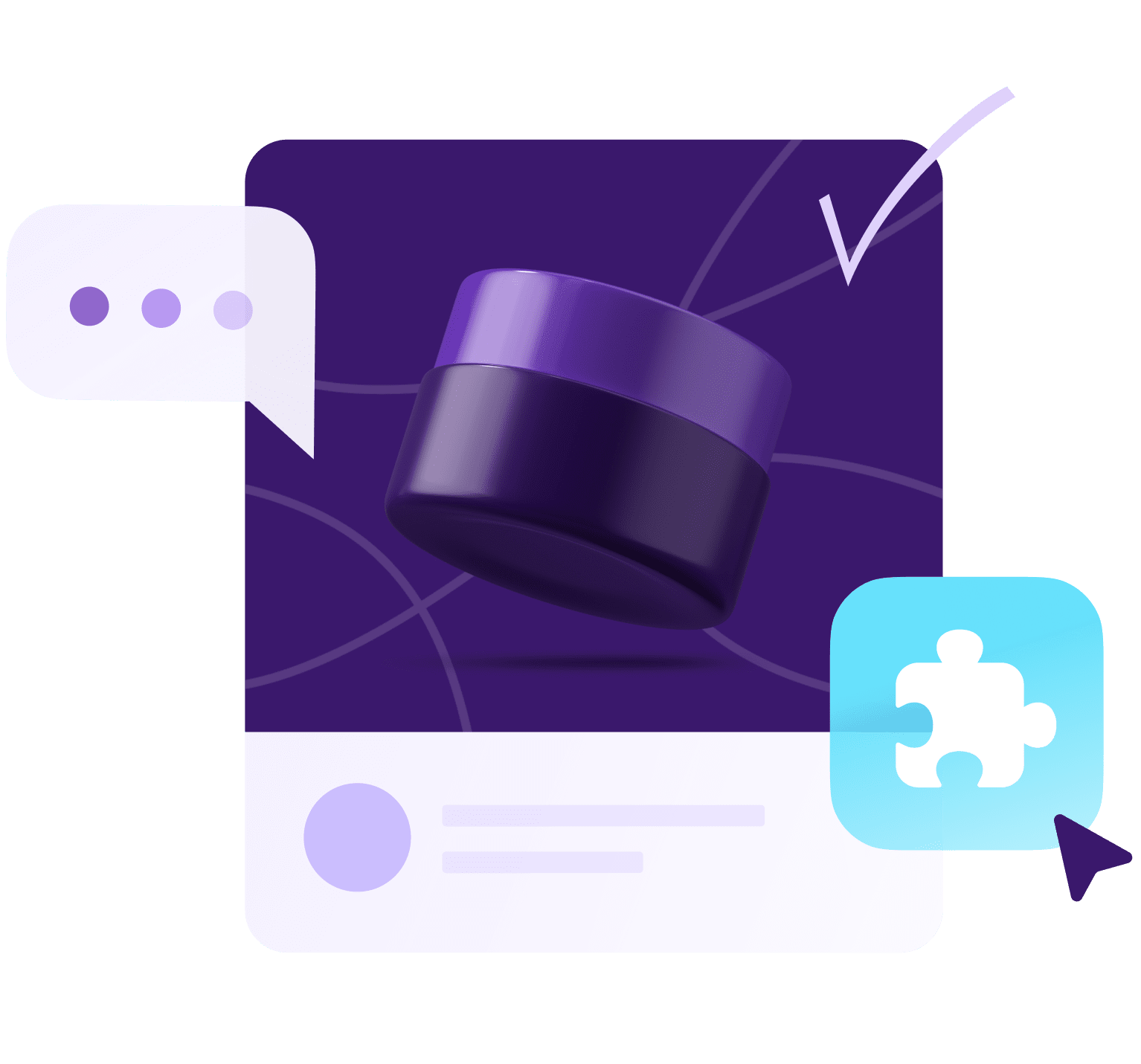
Already sell on Woo? Our Marketplace has hundreds of extensions and themes to boost your conversion and streamline your business.
Custom solutions
for high-volume stores
Woo offers next-level customization, advanced selling features, and dedicated support to help established merchants continue growing.

The most-trusted ecommerce platform for building success ✨
43%
of the web is built
on WordPress
W3Techs, Usage Statistics and Market Share of WordPress
“WooCommerce’s greatest strength is its extensibility. There’s very little I can’t build with WooCommerce. Given enough time and resources it can be finely tailored to even your store’s most niche feature.”
 Kathy Darling,
 Start growing your business with Woo
Whether you’ve got dreams of selling online or want to build stores for others, you can do it with Woo. Start your journey by finding a host.